

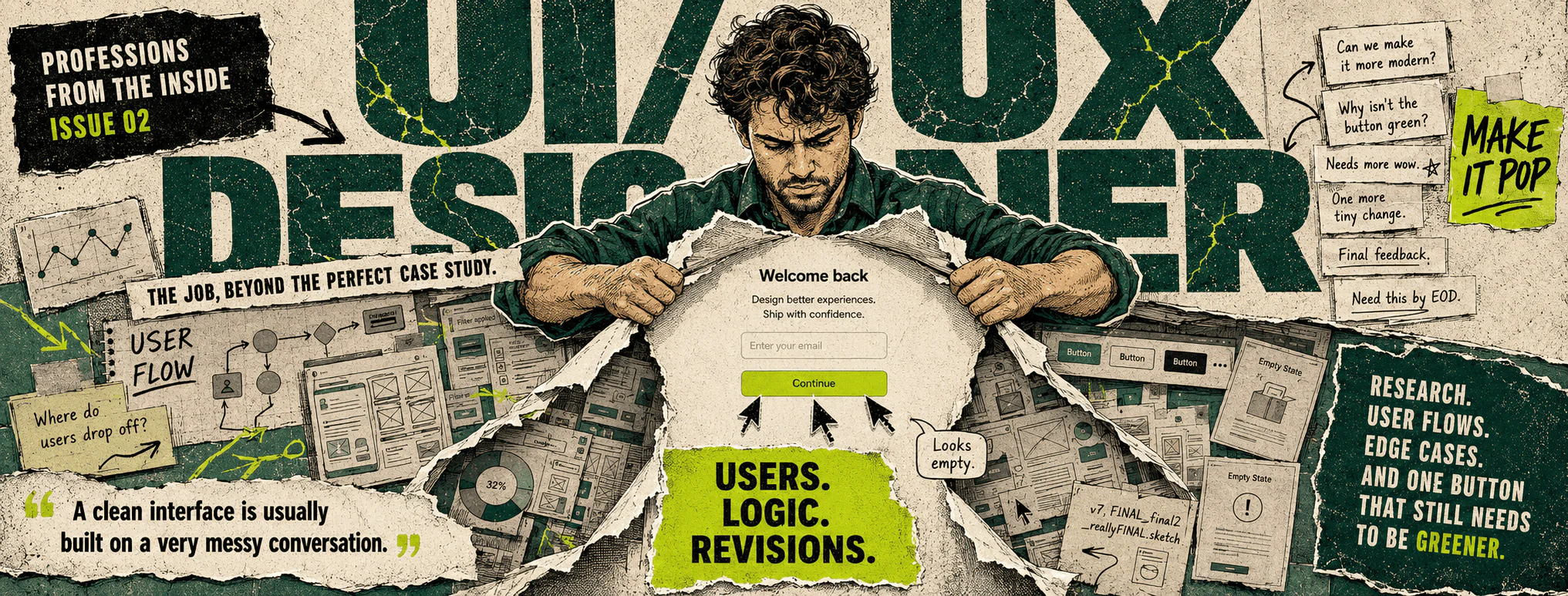
A Day in the Life of a UI/UX Designer: Between Product Logic and Management Feedback
If courses, promotional videos, and people who have opened Figma twice are to be believed, a UI/UX designer’s day looks something like this: they sit down by a window with an attractive cup of coffee, move a few tidy rectangles around, choose the right shade of green, and then receive the gratitude of the business, its users, and probably civilization itself. By evening, the product is easier to use, conversion is up, and the developers are giving them a standing ovation. All of this does exist. Usually in a course presentation, on the slide immediately before the tuition fee.
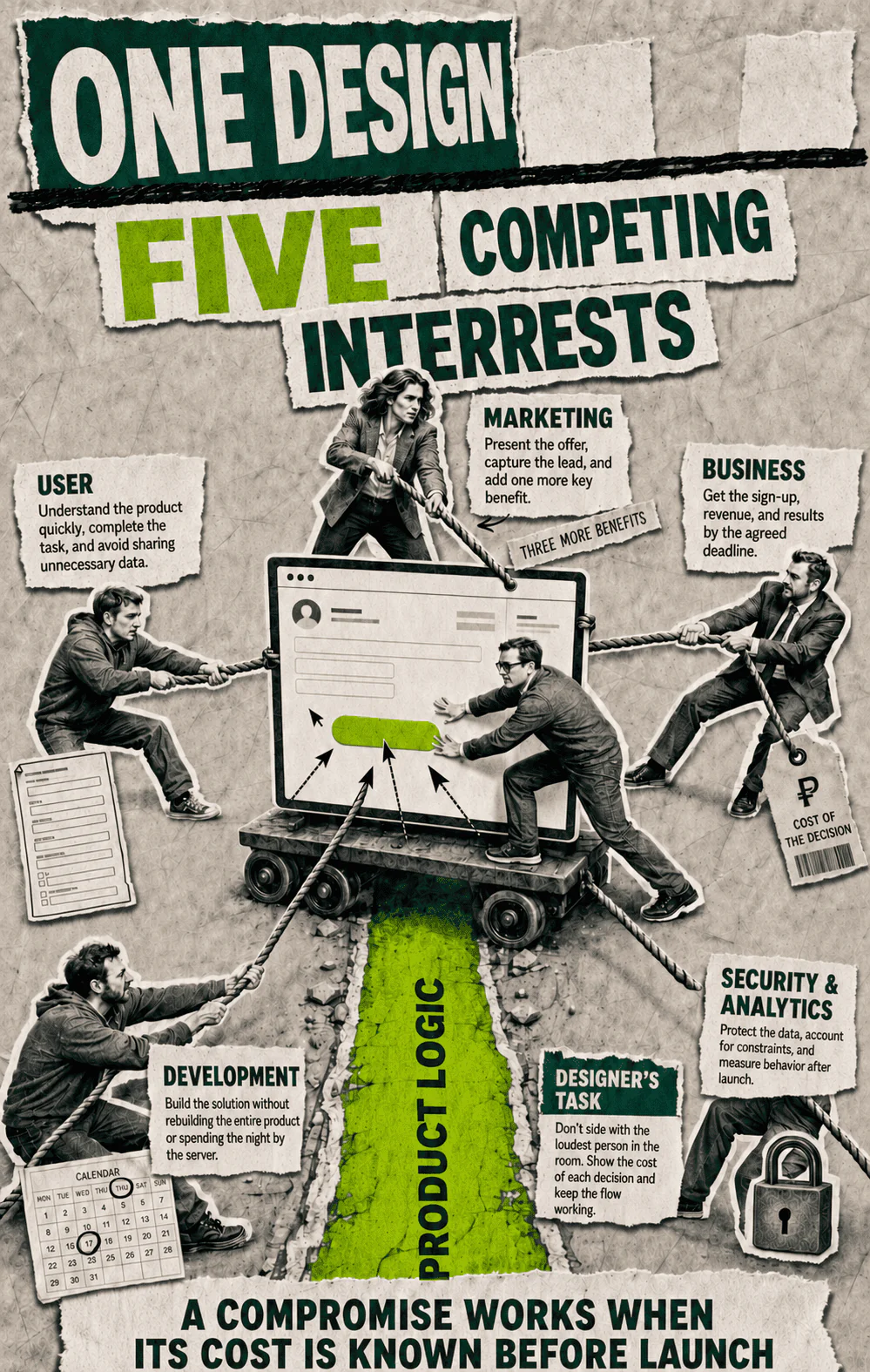
In a real company, a designer starts the day not with creativity, but with an investigation. They have a three-word message from their manager, a five-word ticket in the task tracker, an outdated mockup that no longer matches the live product, and ten people with different ideas about what actually needs to be done. One wants to increase sales. Another wants it to look “like Apple.” A third has already promised the client a Friday release. A fourth has come to announce that development has two days and one exhausted engineer available. The user is not present at this meeting. In fact, users are rarely invited to meetings dedicated to their happiness.
That is why an ordinary day for a UI/UX designer does not take place somewhere between beautiful and ugly. It happens at the intersection of product logic, development constraints, business metrics, user habits, and the personal taste of whoever has “approve design” in their calendar. The last factor sometimes carries more weight than all the others combined. Not because the manager is necessarily incompetent or unreasonable. A job title simply has its own gravitational pull: the higher someone sits in the hierarchy, the faster their personal “I don’t like it” turns into two days of work for someone else.
Let’s break down one such day without the decorative smoke screen. Not an exemplary day from a training manual and not a disaster that ends with the designer updating their CV in a bathroom stall. Just a normal working day in a product team where people are generally competent, deadlines generally exist, and requirements generally resemble a living organism that feeds on comments and reproduces by splitting itself in two.
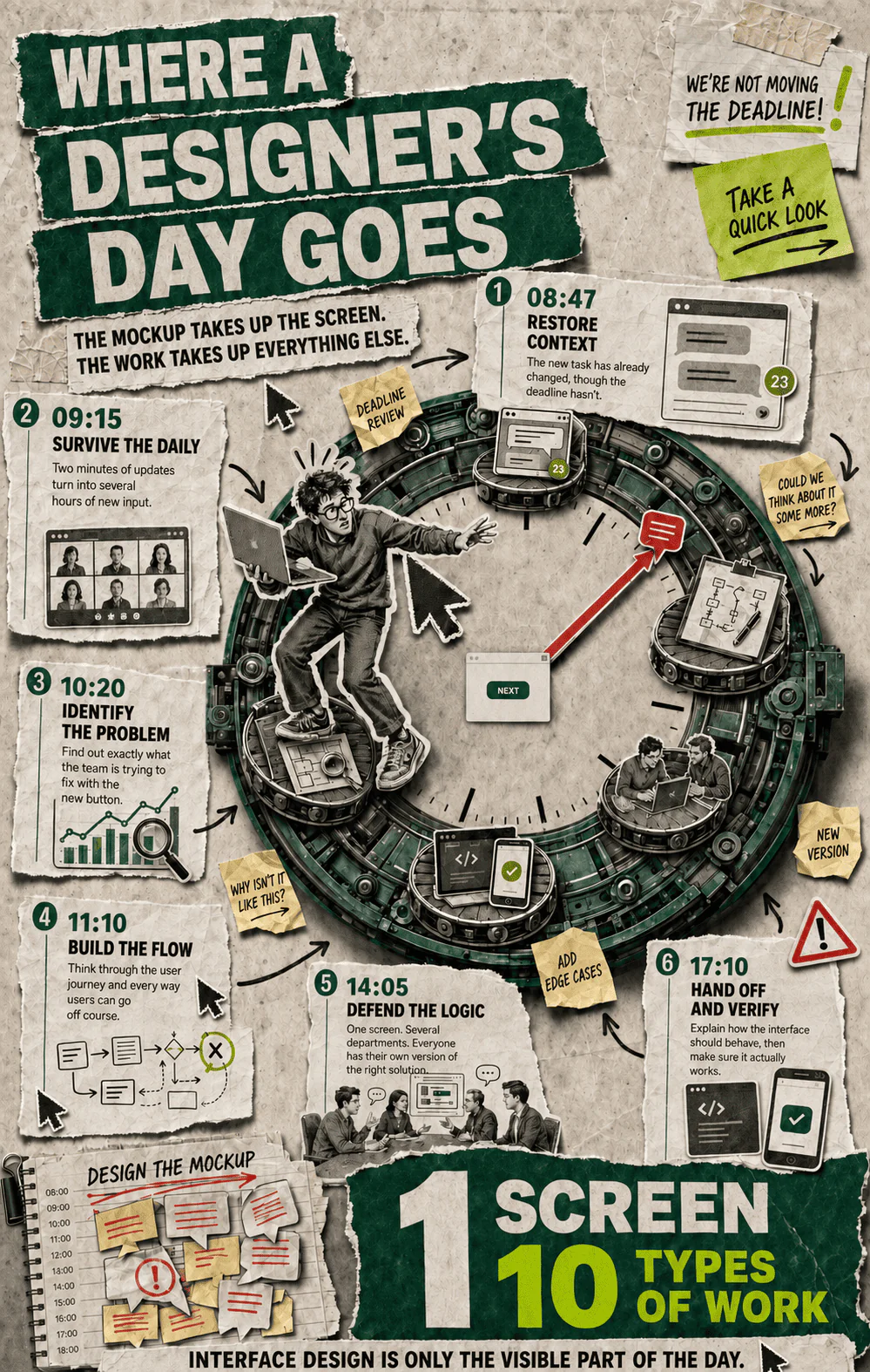
8:47 a.m. The designer’s first discovery of the day: yesterday’s solution is already obsolete
The working day begins in the team messenger. While Figma loads, the designer sees a message sent at 10:36 p.m.: “Had another look. I think we need to completely rebuild the first screen.” At 10:41 p.m., a clarification appeared: “Just don’t change too much, and the deadline stays the same.” This is an important genre of corporate literature. In two sentences, the author destroys yesterday’s work while simultaneously forbidding anyone from spending time on a replacement.
Next to it are comments from the product manager, a developer, and someone from marketing. The product manager wants to simplify the registration flow. The developer writes that the proposed data validation will require an additional server-side method. Marketing wants to add three more benefits, a promo code, and a bright banner because apparently users are expected to enter the product fully informed, highly motivated, and slightly blinded. Multicolored cursors begin appearing in the mockup. Each cursor represents someone who has come to make the interface clearer. The interface begins to resemble a crime scene.
The designer’s first professional action is not opening the right frame. First, they reconstruct the context. What changed after yesterday’s discussion? Is there new information, or did someone simply look at the mockup with fresh eyes? Which decision has already been approved? Who has the authority to reverse it? Is there a technical constraint, or merely anxiety about an unfamiliar option? If the designer starts fixing everything at once, by noon they will have produced a flawless answer to a question nobody asked.
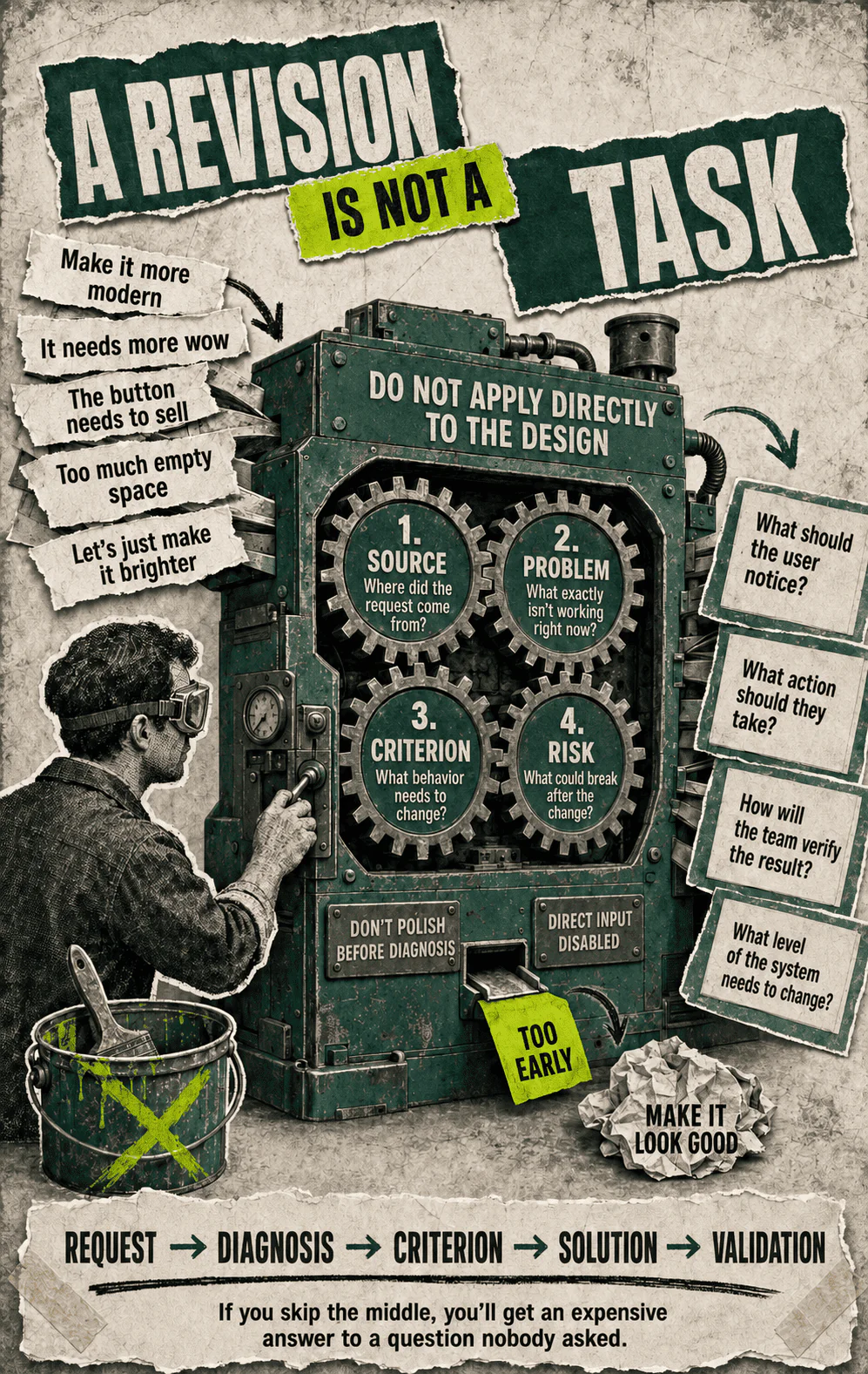
This is the first dividing line between someone who knows how to use a graphics editor and a product designer. The first reacts to an incoming comment. The second determines what event or concern the comment reflects. The phrase “make the first screen more convincing” might mean poor conversion, a manager’s anxiety about the launch, a complaint from one important client, a new advertising offer, or a personal dislike of white space. Visually, all five problems may look identical: someone asks for a large green button. In reality, they are five different tasks, and only one of them might be solved by a button.
The designer opens the analytics, the ticket, the recording of yesterday’s meeting, and the live product. Twenty minutes have already passed. Not a single rectangle has been drawn. From the outside, it looks as though work has not started yet. In reality, this is the moment that determines whether the team will have to rebuild the entire screen a week from now.
9:15 a.m. The daily stand-up where everyone speaks for two minutes and the designer receives half a day’s work
The purpose of a daily stand-up is to get the team aligned quickly. In theory, everyone says what they did, what they are going to do, and what is blocking them. In practice, the developer explains an authentication problem, the analyst searches for the right report, the product manager remembers yesterday’s conversation with management, and the designer realizes that the team has already discussed the mockup without them. It is not a conspiracy. Conspiracies are usually better organized.
During the stand-up, it emerges that the team wants to change the first screen because of a new hypothesis: users do not understand the value of the feature before registering. There is no solid evidence yet. There are several support requests, an observation from the sales team, and the manager’s conviction. None of this can simply be dismissed. Support and sales are often the first to see a genuine problem while the product team is admiring its pristine dashboards. But the wording cannot be taken literally either. Users may understand the value perfectly well and still refuse to register because the form demands their phone number, a password, email confirmation, the name of their cat, and consent to receive newsletters until the end of their natural life.
The designer starts asking questions. At which step do people leave? Which traffic sources brought them there? What does the advertising promise? Are there session recordings? What do users who completed registration say? Could the feature be shown before an account is created? At this point, the designer risks looking like someone who is complicating a simple request. After all, the request was clear: make it more convincing. The problem is that “more convincing” cannot be placed into a mockup. It is not a component, a state, or a property of the copy. It is a useful phrase for concealing the absence of a diagnosis.
A good designer does not defend every pixel in a meeting as if it were a family heirloom. They defend the connection between the problem and the solution. If the team has demonstrated that the chosen flow does not work, the mockup should be discarded without a funeral ceremony. If the solution is changing because someone in the meeting has grown bored, the designer needs to notice. Otherwise, the product gradually becomes an archaeological layer composed of other people’s passing moods.
By the end of the stand-up, the team has reached a workable agreement: first, check the funnel and support requests, then propose two versions of the opening screen. One will make minimal changes to the current flow, while the other will allow users to try the feature before registering. The deadline has not vanished and the developer has not multiplied, which means that the second version currently exists in the category of “a sensible idea the budget may strangle with its bare hands.”
9:45 a.m. The task finally stops being a collection of wishes
The most underrated part of UX work has a very dull name: defining the problem. It contains no gradients, animations, or attractive smartphone mockups, but it does provide a chance of avoiding a week spent building something pointless. The designer writes down who encounters the problem, where it appears in the flow, what prevents the person from continuing, and which product behavior should change after release.
This sounds elementary until someone has to do it in real life. The business says, “We need to increase registrations.” The user says, “I just wanted to see what was inside.” Development says, “Guest mode will affect access permissions.” Security says, “There will be no guest mode.” Marketing says, “We need a form so we can capture leads.” Everyone is telling the truth; they are simply holding different parts of the animal and confidently describing the whole creature.
The designer’s job is not to choose the loudest participant. They need to bring all the constraints into a single model and identify where the real choice lies. Perhaps it is more profitable for the product to lose some registrations while gaining higher-quality leads. Perhaps mandatory registration genuinely prevents users from exploring the feature. Perhaps the problem begins in the advertising, which promises a free tool and sends people to a pricing page. In that case, the new interface will be an expensive napkin placed neatly over a leaking pipe.
A properly defined task has criteria. Users should understand the value of the service before entering personal information. The main flow should take no more than a defined number of steps. The team should be able to see how progression to registration changes. The solution should not require a complete rebuild of the permissions system. These constraints do not make the work less creative. They tell the designer which room they are allowed to rearrange and which wall has a gas pipe running behind it.
At the same time, the designer checks what already exists in the design system. Can the necessary flow be assembled from existing components? Is there a suitable template? How do fields, errors, hints, and modal windows behave? Beginners often see a component library as a tedious obstacle standing between them and self-expression. An experienced designer sees infrastructure. Every new custom element looks harmless while it remains in a mockup. After release, it acquires a mobile version, dark mode, localization, loading states, documentation, and lifelong maintenance. That is how one small custom button develops the running costs of a pedigree horse.
By ten o’clock, the task has become more precise. The designer has still drawn almost nothing, but now knows what should not be drawn. This is one of the main forms of professional efficiency. It is difficult to show in a portfolio because empty space does not look particularly impressive in a case study, even when that empty space has saved the company a month of development.
10:20 a.m. Research that rarely looks like research
The word “research” conjures images of laboratories, lengthy reports, and people who say “sample size” with the gravity of a government official. In product work, research often looks far less impressive. The designer opens support tickets, watches several session recordings, reads reviews, compares segment behavior, and calls the analyst. Sometimes there is a week and a dedicated researcher. Sometimes there are forty minutes and a support specialist who remembers the users better than the analytics system does.
The biggest danger here is not a lack of data. At least a lack of data is visible. Far worse is having data that answers the wrong question. For example, the team can see that half of all visitors do not complete registration. That is a fact. Then the theories begin: the form is too long, the value is unclear, people do not want to provide a phone number, or the button is not prominent enough. The final theory usually attracts a surprising number of supporters because changing a button’s color is easy and enjoyable to discuss. User anxiety, traffic quality, and alignment between promises and reality require less photogenic work.
The designer watches the session recordings. Some people click an inactive element several times. Others scroll back up to reread the description. A third group leaves after reaching the phone number field. Several users complete the entire flow without difficulty. There is no honest way to draw a single conclusion from this. It is possible, however, to separate the problem into parts: the value is indeed not immediately apparent, while the mandatory phone number creates an additional barrier. The team can still repaint the button if it has been a dull quarter and there is some paint left over.
Next, the designer reads the support requests. Users do not speak the language of product teams. They do not write, “The information architecture conflicts with my mental model.” They write, “Where can I see an example?”, “Why do you need my number already?” or “I clicked it and nothing happened.” A UX designer’s job begins with translating those phrases into systemic problems. At the same time, every complaint cannot be turned into a separate feature. One person might ask to export a report in an obscure format, print it on parchment, and have it delivered by carrier pigeon. That is feedback. It is not yet a strategy.
Good research does not guarantee one obvious solution. It reduces the space available for speculation and shows which assumptions the team is making consciously. Based on the findings, the designer formulates a hypothesis: if users are shown a short interactive demonstration before registration and told why their phone number is needed, more qualified users will proceed to create an account. The mockup can now be assessed not by the level of collective enthusiasm it inspires, but by whether it helps test that hypothesis.
11:10 a.m. The user flow: the part of the job that does not make an attractive carousel post
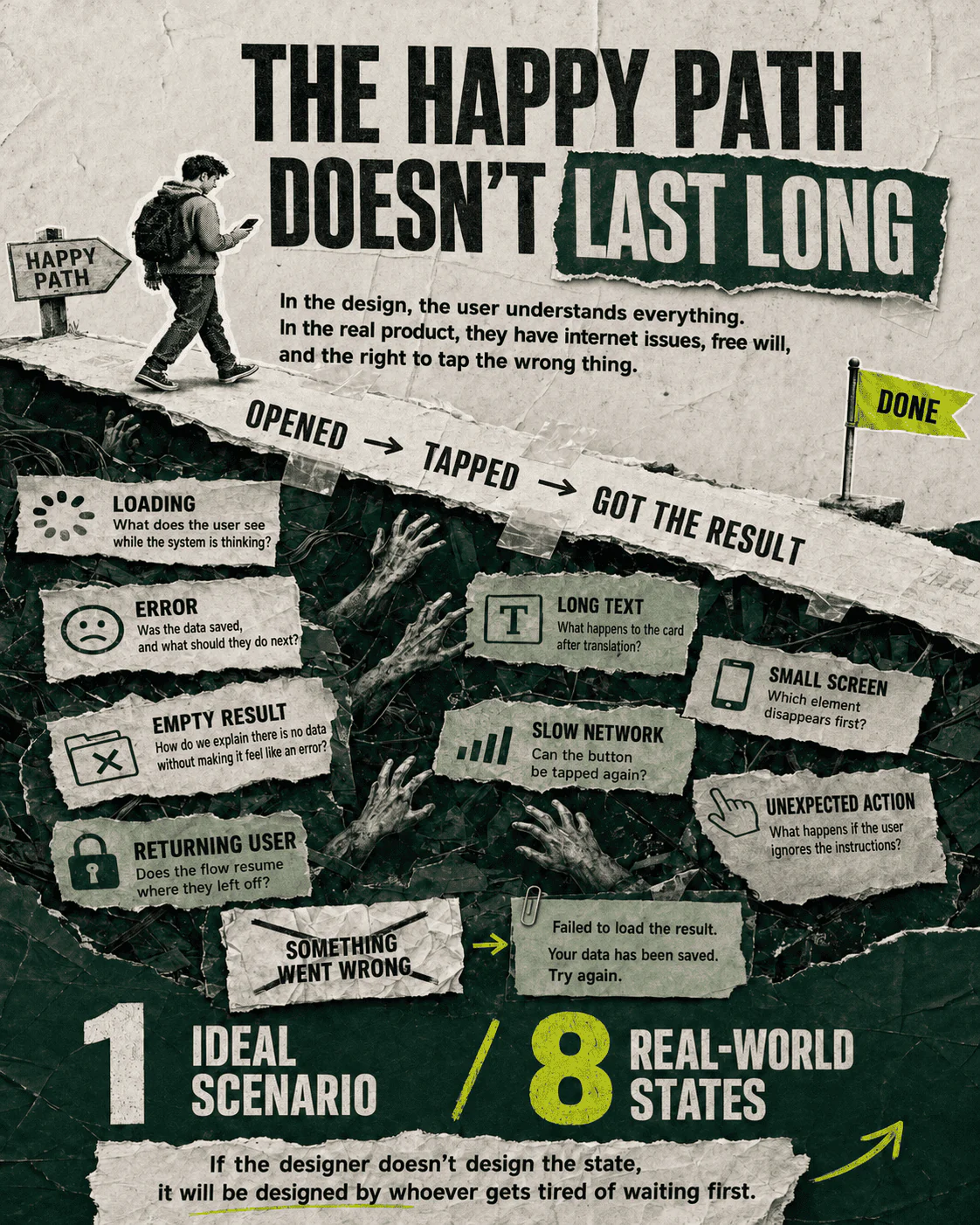
Before designing the interface, the designer needs to map the journey. They lay out the flow: entry from the landing page, selection of an example, a short action inside the demonstration, display of the result, and an invitation to save it after registration. Then they add branches. What happens if the data does not load? If the user goes back? If the example is unavailable? If they are already registered? If they open the link on a small screen? If their internet connection decides to test their character?
This is where the interface stops being a picture. A picture exists in one perfect state: the data has loaded, the user understands everything, the server is feeling energetic, the text fits, and the person’s name is seven letters long. A product exists in every other state. It must survive empty results, errors, long surnames, repeated clicks, expired sessions, slow connections, and people who ignore instructions because that is precisely what people are given instructions to do.
The designer does not draw the flow diagram as a ritual. It reveals how many decisions are hiding behind a single screen. A “Continue” button looks simple until someone has to decide when it becomes active, where it leads, what it saves, how it responds to a double-click, and what it says when something goes wrong. Every unanswered question will eventually be answered by a developer. It will not necessarily be a bad answer. It will simply be made while that person is busy writing code and has very little desire to discuss the emotional life of a button.
The flow reveals a conflict. An interactive demonstration gives users value before registration, but an accurate result requires server data that is only available inside an account. The team could create a limited example using a prepared data set. It could show a video. It could shorten the registration form. It could preserve the existing order while explaining the value more clearly. There are several options, and each pays in its own currency: time, accuracy, conversion, trust, or maintenance complexity.
The designer discusses the choice with the product manager and a technical specialist. They select a limited demonstration based on a prepared example. It is neither the most impressive nor the most complete solution. It can, however, be released, measured, and expanded if necessary. Product design often consists of solutions that look modest but survive their first encounter with reality.
By 11:40, there is a rough flow and a handful of low-fidelity screens. They are gray, unattractive in places, and useful. A gray rectangle allows people to debate the sequence of actions. A perfectly rendered card makes them debate corner radiuses. The brain likes to latch on to whatever is easiest to assess. That is why an early mockup should be clear enough to test the logic and unattractive enough to prevent anyone from approving a shadow color.
12:05 p.m. UI does not begin with choosing a color
Once the flow is assembled, the designer moves on to the interface. This is where outside observers finally begin to relax: familiar elements appear on the screen, along with a grid, typography, buttons, and cards. It seems that the real work has finally begun. Apparently, the previous three hours were a warm-up during which the designer stared professionally at a monitor.
UI solves far more problems than decoration. Visual hierarchy shows what matters, what is connected, and what can be done next. The size, contrast, spacing, and position of elements direct attention. Copy explains the consequences of an action. States tell users that the system has registered what they did. If an interface is attractive but people do not know where they are or what will happen after they click, what we have is confusion with excellent art direction.
The designer assembles the screen from system components. They check the grid, spacing, line length, contrast, and tap-target sizes. They see what will happen on a mobile device. Not every user sits in front of a designer’s monitor, although some mockups behave as though this requirement were written into the terms of service. On a phone screen, all that luxurious white space disappears, a long heading occupies four lines, and two buttons begin fighting over territory.
Then comes the copy. In a poor process, it is added at the end like parsley sprinkled over a finished dish. In a proper process, the copy is part of the flow. The label “Get started” does not explain whether the user is about to begin registration, launch the demonstration, start a free trial, or open a new chapter in their relationship with the sales department. The caption beneath the phone number field must explain honestly why the number is required. An error should help users correct their action, not merely declare them guilty in red.
The designer writes several versions, cuts them down, tests them with real data, and calls in a UX writer if one is available. If there is no writer, the designer temporarily becomes one. Then they temporarily become an analyst, an accessibility specialist, and the person who reminds everyone that the interface will be translated into other languages. The job title is UI/UX designer, but the role regularly produces unpaid part-time vacancies within itself.
By 12:30, the main version is ready. It is not a work of art, nor should it be. It demonstrates the value of the feature, lets users complete a short demo, explains the registration step, and uses familiar components. Now the solution needs to be shown to other people. That is where its adult life begins.
1:00 p.m. Lunch, which technically exists
The calendar contains an hour for lunch. In reality, five minutes before it begins, a message arrives: “Can you take a quick look at the mockup?” In a product team, the word “quick” does not describe duration. It reduces the guilt felt by the person scheduling a meeting for the exact moment you have opened a food delivery app.
The designer sends the link and tries to step away from the screen. A minute later, the first comment appears: “Why is there so much empty space here?” Two minutes later comes another: “I think the main section gets lost.” After three minutes, the product manager suggests a call after lunch. The body receives food while the brain continues arranging arguments. This is what corporate wellness looks like: someone eats soup while mentally defending vertical spacing.
It helps to understand one thing here. A designer does not need to treat every comment as an attack. People genuinely notice problems that the author of a mockup has stopped seeing. After several hours of work, the eye adapts, the logic begins to seem obvious, and familiar copy is read faster than a new user would read it. A fresh perspective is valuable. Even the phrase “something feels off” can point to a real defect; the speaker may simply be unable to name it yet.
A comment, however, is not the same thing as a solution. If someone thinks a section gets lost, that is a reason to ask which element they considered most important and where they looked first. A request to enlarge the heading is one possible reaction, not a completed technical specification. Designers are paid in part to avoid confusing a symptom with a prescription.
After lunch, the designer performs a quick review. They remove a piece of secondary copy, strengthen the relationship between the demonstration and its result, and adjust the spacing. In other words, they change the mockup before the meeting because some of the feedback is valid. A professional position does not consist of ceremoniously refusing to move pixels. It consists of distinguishing a justified improvement from rearranging furniture during a fire.
2:05 p.m. Design review: eight people look at one screen and see eight different products
The meeting is attended by the designer, the product manager, the head of the department, a developer, someone from marketing, an analyst, and two people whose roles are initially unclear. One of them will later ask more questions than everyone else. That is how nature works: an empty niche is quickly filled.
The designer does not begin by showing the mockup. They begin with context: which problem was identified, what the data shows, which hypothesis the solution is intended to test, and which constraints were taken into account. This is not a bureaucratic prelude. Without it, the participants judge the screen like a poster: they either like it or they do not. With context, there is at least a chance that they will discuss whether the interface solves the problem.
The first few minutes are productive. The analyst clarifies which event will be used to measure completion of the demo. The developer points out that one state cannot be implemented within the existing architecture. Marketing proposes a more precise way to express the value. The designer records the changes. Then the department head asks, “Why isn’t the button green?”
It is a perfectly reasonable question. Color can affect visibility, brand consistency, and the recognition of an action. The problem begins when there is no criterion behind the question other than the manager’s impression that green buttons sell better. The designer explains that the primary color is already used for another type of action, while the new button occupies a high-attention area and has sufficient contrast. The manager looks at it for a few more seconds and says, “I still want it to be green.”
A familiar silence settles over the room. Officially, the team is discussing design. In reality, it is deciding whether the rules of the system carry more weight than the intuition of the person responsible for the result. The designer can surrender immediately, launch into a lecture about cognitive load, or ask a useful question: what problem is changing the color supposed to solve? If users are not noticing the button, that can be tested. If it does not appear important enough, there are several ways to strengthen the hierarchy. If green is required because of a new communications campaign, that is a systemic change.
The manager explains that the screen feels too quiet and does not encourage action. This is better. Now the discussion is no longer about a favorite color, but about the intensity of the visual emphasis. The designer presents an option with stronger contrast while preserving the system’s logic. The team agrees to test both versions in the prototype. The green button temporarily returns to the forest, where it belongs until evidence emerges.
Then the team starts discussing the demonstration. One participant suggests adding more hints. Another thinks the hints overload the screen. A third asks to show every available feature at once so users will definitely understand the value. This is a popular method of explanation: if someone has failed to understand one thing, show them nine things simultaneously. By the same logic, a lost tourist should be given every map of the city and shaken gently.
The designer brings the conversation back to the sequence. At the first step, the user should see one clear result. The other capabilities can be revealed after the action. Otherwise, the demonstration will turn into a guided tour of a feature warehouse. The product manager supports the decision, marketing asks to preserve one additional sentence, and the developer reminds everyone about the deadline. Forty minutes later, the mockup has acquired a list of changes, two open questions, and the status “generally approved.” In corporate language, this means the structure has not yet been demolished, although the construction equipment remains nearby.
3:00 p.m. Management feedback: where feedback ends and anxiety management begins
After the meeting, the designer receives a private message from the manager: “Let’s still try a brighter version. And can we make it look more modern?” The word “modern” occupies an honored place alongside “premium,” “lighter,” and “wow.” Everyone understands the emotional direction; nobody knows the unit of measurement.
Designers are often irritated by management feedback not because a manager has intruded upon the sacred territory of color. What frustrates them is the destruction of cause and effect. The designer has spent hours assembling data, a user flow, and constraints, only for the solution to be changed because of an impression formed in seven seconds. It is like an architect completing all the structural calculations and then being told that the staircase needs to look more energetic. The request may be reasonable. First, however, someone would like to confirm that “more energetic” can support the weight of actual people.
At the same time, the manager may have something the designer does not: accountability for commercial results, knowledge of partner negotiations, an understanding of strategy, experience from previous launches, and information that has not yet made it into the ticket. Their intuition is not necessarily a whim. Sometimes it is compressed experience that the person has not yet unpacked into an explanation. The designer’s job is not to resist authority automatically, but to extract a criterion from vague language.
The designer asks questions. What exactly does not look modern enough: the typography, density, illustration, or character of the components? Which products is the manager comparing it with? What impression should the user receive? What currently prevents that impression? After several messages, it emerges that the manager recently showed the product to a potential partner, who described the interface as “too utilitarian.” The entire company is now treating an adjective used by one person in a meeting.
The signal cannot be ignored. In a B2B product, partner perception can affect sales. At the same time, rebuilding the user flow for the sake of an undefined sense of “modernity” is dangerous. The designer proposes separating the issues: preserve the logic of the demonstration while strengthening the visual presentation through typography, the result graphic, and the styling of the accent area. The revised version can then be shown to management and marketing without changing the components on which the rest of the product depends.
This is what healthy processing of feedback looks like. It is neither “I am the artist and this is my vision” nor “the boss said so, so get the paint.” First, the designer identifies the source of the request. Then they translate it into an observable quality. Finally, they change the smallest necessary level of the system. If the problem is brand perception, there is no reason to dismantle the registration flow. If the problem is conversion, a new gradient is unlikely to appoint itself chief commercial officer.
Sometimes things are worse. A manager may insist on a specific solution and refuse to discuss the criteria. In that case, the designer has three remaining responsibilities. The first is to explain the risk clearly. The second is to document the decision that was made. The third is to implement it professionally, provided that it does not violate the law, ethical standards, or the product’s basic usability. Being an employee does not give a designer veto power over every controversial button.
This is an unpleasant but mature part of the profession. A designer influences a decision but rarely owns it alone. The larger the product, the more owners, constraints, and people capable of saying “no” it has. If a specialist needs complete creative autonomy, joining a product team will be an educational experience. Here, even a copy error may require legal approval, while the color of an icon can be discussed for longer than the conditions under which it appears.
On the other hand, silently implementing every request quickly turns a designer into a graphics terminal. The manager enters a command and the system outputs a mockup. Such a specialist is convenient until the first serious failure, when everyone suddenly remembers that they “should have warned us.” Objections therefore need to be precise, not loud. The goal is not to prove that the manager knows nothing about design, but to show the consequences: this section pushes the key action below the fold; this copy promises a feature that does not exist; these two equally strong accents compete with each other; this pattern contradicts the behavior of the other sections.
Good reasoning does not guarantee victory. It makes the decision transparent. In product development, that is already a great deal. At least the team understands what price it is paying and why. And if the experiment fails a month later, the discussion can begin with the data rather than a search for the person who chose blue without enough passion.
3:45 p.m. The redesign where twenty percent of the screen changes and one hundred percent of the details do
The designer returns to Figma and creates a new version. They preserve the flow, strengthen the accent area, change the scale of the heading, and revise the result graphic. At the same time, they check whether the responsive version has fallen apart. Every request to make something “slightly larger” sits within a chain of dependencies. The heading wraps onto another line, the card becomes taller, the next section moves down, and the button disappears from view on a small screen. One comment can unravel a mockup like a loose thread in an old sweater.
Next, the components need to be brought into order. If only this particular screen is changed, the developer will receive a unique exception. If the main component is changed, other parts of the product will update as well. The designer checks variants, properties, and nested elements. None of this work is visible in the final image, but its absence becomes very visible two months later, when the file contains twenty nearly identical buttons named “Button final,” “Button final 2,” and “Button new real.”
Versions are a separate form of corporate archaeology. The designer needs to preserve the original version, the new version, the approved version, and the version the manager asked to restore after seeing the new one. Without basic organization, the mockup begins to preserve the history of decisions more accurately than the team does. Its layers reveal distinct periods: early minimalism, the era of the large green button, the brief reign of illustrations, and the great return to Tuesday’s version.
While the designer works, a comment arrives from the developer: the selected result animation will take longer than expected. It can either be simplified or postponed. The designer assesses whether the animation conveys meaning. If it shows the transition between states and helps users understand the result, at least the core principle should be preserved. If it exists so a card can sway pleasantly, the card will survive remaining still. So will the user. They may even finish the task more quickly.
By 4:30, the version that addresses the manager’s request without breaking the logic is ready. It is sent for a brief approval along with an explanation of what changed, what was preserved, and which risks remain. This matters because a link without context immediately launches another competition between personal impressions. An explanation cannot completely protect a design, but it can at least avoid leaving it alone in a room with eight cursors.
4:35 p.m. Interface states everyone remembers after release
The main screen has been approved. Now the designer begins the work everyone likes to postpone: states and exceptions. What does the user see before loading? During loading? When an error occurs? When there is no result? After completion? On a repeat visit? What happens if the demonstration is unavailable on the user’s plan? What does a long system message look like? Can the action be repeated?
Product presentations usually show the happy path. The user arrives, clicks, receives a result, and smiles in the general direction of conversion. In the real product, they forget their password, close the tab, block cookies, paste a space into their phone number, and click the button three times. The interface needs to have a plan for this version of life, even if the team prefers not to imagine it.
The designer adds loading, error, and empty states. They review the copy. “Something went wrong” honestly describes the system’s emotional condition, but does nothing for the user. The message needs to explain what failed, whether the data was saved, and what the person can do next. If the problem cannot be fixed, the interface should not keep suggesting that the user “try again.” At that point, it is no longer assistance but a small digital ritual of despair.
Accessibility is checked separately: contrast, keyboard focus, element labels, reading order, and whether errors remain understandable without relying on color alone. Accessibility is often treated as an optional layer intended for a small group of users. In reality, temporary and situational limitations affect everyone: bright sunlight, an injured hand, a slow connection, fatigue, a small screen, or poor sound. A design intended exclusively for a healthy, attentive person in perfect conditions is intended for a character from a technical specification. This person is rarely observed in the wild.
Once again, this work conflicts with the deadline. A complete set of states takes time, while development wants to begin today. The designer hands over the main flow and critical error states, then agrees on time for the remaining ones. This is an acceptable compromise when it is explicit. If they simply send one attractive screen and hope the details will materialize by themselves, the details will indeed materialize. They will simply be chosen by whoever gets tired of waiting first.
5:10 p.m. Developer handoff: the moment when the picture needs to become behavior
The phrase “the mockup is ready” means nothing until a developer can use it to build the product. A handoff requires more than dimensions and spacing. It requires rules: how the section changes, which data is mandatory, what happens after an action, which states exist, where an existing component is used, and where a new one appears. A good handoff reduces guesswork. A poor one turns the developer into a co-author of the interface without giving them any time for the role.
The designer cleans up the file, names the frames, connects the prototype, and adds explanations. They confirm that layouts for different screen sizes do not contradict one another. They specify how elements behave as the width changes. They attach the copy and requirements for the graphics. This is not bureaucracy performed for the aesthetic purity of the layers panel. A developer should not have to guess which of four versions was approved or why one card is accidentally positioned seven pixels farther to the left.
Then they have a short call. The developer asks questions that instantly expose weak points. Where does this parameter come from? Can the result be opened again? What happens if the user has already started registration in another tab? Why does the order of the sections change on mobile? The designer answers some questions and takes the others back to the product manager. Once again, the mockup turns out to be a form of conversation rather than the final word.
In a mature team, developers become involved earlier, so there are fewer major surprises. In an immature team, the design is handed over like an order at a restaurant: here is an attractive photograph, please have it ready by Friday. Then everyone discovers that the ingredients are unavailable, the kitchen works differently, and the photograph was created for an advertising shoot and was never intended to be eaten.
By six o’clock, the task has moved into development. A new status appears in the tracker, creating a pleasant illusion of completion. The designer knows that the implementation will still need to be reviewed. The interface in Figma behaves impeccably because pixels are disciplined and do not have to communicate with a database. The real test begins when the solution meets code.
6:00 p.m. Implementation review: “almost like the mockup” and other units of measurement
The developer sends a link to the test build of another task that was handed over several days ago. The implementation needs to be reviewed. At first glance, everything looks similar. At second glance, the heading has a different weight, the container is narrower, the icon has shifted, the error message is different, and the button jumps after loading. None of these defects looks fatal on its own. Together, they create an interface that seems to remember the mockup from stories told by distant relatives.
The designer must avoid producing a list of forty comments with the same level of urgency. A critical problem in the user flow and a two-pixel spacing difference should not appear side by side as equal threats to humanity. The designer checks the logic first, along with action accessibility, state behavior, and content accuracy. Then come visual hierarchy, responsiveness, and consistency. Small discrepancies are corrected if they affect quality or accumulate into systemic debt, not because the designer needs an excuse to end the day in a state of righteous exhaustion.
One problem is serious: after an error, all the entered data is cleared. The user will have to complete the form again. The developer explains the technical reason and proposes fixing it in the next sprint. The designer explains the consequences: the error may occur after several steps, losing the data increases the likelihood that users will leave, and the experience damages trust. The product manager changes the priority. This, too, is design work, even though it once again contains no font selection.
Another problem is resolved through compromise. The animation differs from the prototype, but it preserves the meaning and performs better. There is no reason to rebuild it solely for visual fidelity. The ability to accept a good implementation that looks different is more valuable than the ability to measure the duration of every transition. A design system exists to support consistency, not to establish a small totalitarian state inside the interface.
The feedback is documented in the ticket with screenshots and priorities. The developer asks for clarification on two points. The designer responds without saying, “Well, obviously.” If something is obvious only to the author of the mockup, it is not obvious. Telepathy remains outside the standard team toolkit, despite the optimistic number of processes designed around it.
6:40 p.m. The working day ends, but the evaluation of other people’s decisions stays in the designer’s head
By the end of the day, the designer has done far more than create one screen. They untangled a contradictory request, gathered data, built a user flow, negotiated a technical compromise, developed the solution, survived a design review, translated subjective feedback into a practical criterion, prepared states, handed the mockup over, and reviewed another implementation. If someone looks only at the final interface, the amount of work appears suspiciously small. The screen still contains a few sections and a single button. The difference is that the team now knows why they are located there and what will happen after the button is pressed.
Psychologically, this profession has an unusual structure. A designer needs to invest deeply enough in a solution to notice every detail while remaining willing to discard it when new data arrives. They need to have a position without turning it into a religion. They need to accept criticism without agreeing automatically. They need to distinguish feedback on the mockup from an assessment of themselves, even though the mockup spent several hours inside their head before emerging without protective packaging.
Constant feedback creates a particular kind of fatigue. The results of the designer’s work are publicly dissected in meetings, comments, and tests. A user clicks the wrong thing, the analytics show a decline, a developer finds a contradiction, or a manager asks for a redesign. It is impossible to spend years preserving the image of someone who always knows the right answer immediately. A product quickly performs an autopsy on that legend.
A resilient designer is therefore not someone who is indifferent to quality. Indifference produces poor mockups, not resilience. A resilient designer knows how to separate three things: their personal worth, the quality of the current solution, and the constraints of the process. A solution may be weak because there was not enough data. It may be reasonable but lose to a business priority. It may be good and still fail. User behavior has signed no agreement promising to match the team’s expectations.
Before closing the laptop, the designer writes down the open questions for tomorrow. The analytics events need to be checked, the secondary states need to be completed, and the updated build needs to be reviewed. A new message from the manager appears: “Had a look at the new version. It’s better. Could we still try the green button for comparison?” Of course we can. Science requires a control group, while corporate life requires humility, preferably accompanied by a saved version of the file.
How a junior, mid-level, and senior designer’s day differs
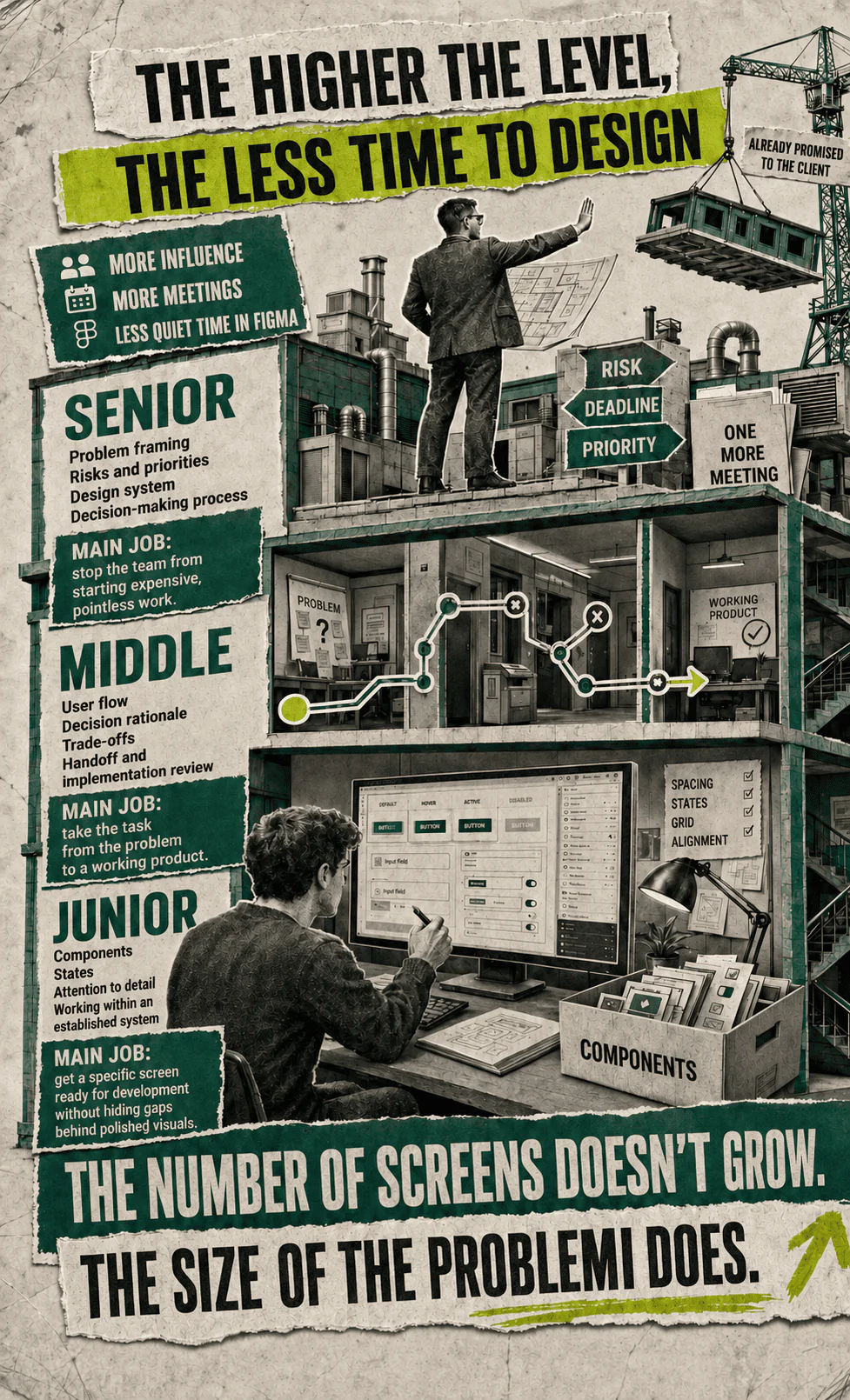
A junior designer is more likely to receive a limited part of a flow and work within decisions that have already been made. Their main task is to learn to see the system: use components, account for states, ask questions, explain choices, and avoid hiding gaps beneath attractive graphics. Many beginners try to prove their value through the originality of the screen. At that stage, the team has greater need for predictability, careful execution, and the ability to carry a solution all the way into development.
A mid-level designer owns the task from beginning to end. They know how to separate a request from the underlying problem, gather context, propose options, run a review, negotiate with development, and assess the final result. They are evaluated not by how impressive a single frame looks, but by the quality of the decision-making chain. A mid-level designer should already understand when to push back, when to test a hypothesis, and when to accept a constraint they dislike.
A senior designer works not only with the interface, but also with the conditions in which that interface is created. They influence how the task is defined, the quality of the data, the decision-making process, the design system, and collaboration between functions. They notice earlier when the team is treating the wrong problem and know how to say so without turning the meeting into a public contest of intellectual superiority. A senior designer is not required to produce the most attractive version faster than everyone else. Their value often lies in preventing the team from beginning expensive and pointless work.
The higher the level, the less time may remain for quiet design work. More meetings, alignment calls, reviews of other people’s solutions, planning, and responsibility for product consistency are added. The designer gains more influence and, at the same time, more ways to spend an entire day without producing a single new screen. For people who entered the profession in pursuit of eight uninterrupted hours alone with visual design, career progression can look like a beautifully designed trap.
Who will enjoy this work, and whose personality it will quickly ruin
UI/UX design suits people who enjoy untangling unclear problems, observing behavior, building systems from constraints, and continually questioning their own decisions. Curiosity, tolerance for uncertainty, attention to detail, and the ability to communicate with very different specialists are all useful here. A love of visual design matters, but it cannot carry a day spent largely asking questions, presenting arguments, and checking exceptions.
The job will be difficult for someone who needs constant external praise. Users do not notice most good solutions. They simply complete the flow without encountering errors. A manager rarely writes, “Today I particularly appreciated the consistency of the form states.” A broken button, however, attracts an audience faster than a free concert. Feedback is distributed unevenly: normal operation remains silent, while a defect activates a siren.
It will also be difficult for someone who treats every requested change as an invasion of personal territory. A product mockup belongs to the team and the business, and after release it meets users who have no obligation to preserve the author’s original vision. At the same time, having no position at all is equally destructive. If someone is willing to move elements around indefinitely without asking why, they will quickly become exhausted and stop developing professionally.
Finally, the profession is unsuitable for anyone who wants to learn the correct rules once and use them forever. Rules change with platforms, products, and context. Even durable principles require interpretation. A designer cannot mechanically put the primary button on the right, reduce every flow to three steps, and declare victory. Sometimes an additional step increases trust. Sometimes a familiar pattern fails with a particular audience. Sometimes the best screen is the one the team decides not to create.
So what does a designer actually do all day?
They turn a vague request into a task, the task into a hypothesis, the hypothesis into a flow, the flow into an interface, the interface into an agreement, and the agreement into a product that must survive development and real users. Between these transformations, the designer explains, debates, cuts, tests, documents, and occasionally turns a button green because experiments need material too.
The work of a UI/UX designer does not exist between product logic and requested changes as though one were a noble craft and the other a pointless punishment. Requested changes contain information too. They reveal the business’s anxieties, gaps in the reasoning, hidden constraints, and the difference between what the team intended to communicate and what another person actually saw. The problem begins only when this information is never examined and is converted directly into pixels.
Professionalism here is measured neither by the number of comments successfully defeated nor by obedience. It is measured by the quality of the decisions that remain after they collide with reality. A strong designer can defend a principle, revise a weak solution, acknowledge a lack of data, document a risk, and carry a compromise through to a workable result. Sometimes this produces a noticeable improvement to the product. Sometimes it produces a green button.
The following day, the analytics will still have nothing conclusive to report, the manager will bring in a new competitor example, the developer will discover another constraint, and a user will do something that appeared in none of the flows. The designer will open the file again and begin working out what is actually happening. An interface can be finished by a deadline. Understanding the product cannot.